
Information Visualization
Jeff's amphibian calling analysis system is an example of GIS-based information display in which the amount of detail shown may be easily controlled. A formal usability study of the system is planned for a web-based version to be implemented in the future.
Amphibian calling
In the spring and summer, toads and frogs call in the evening, particularly during mating season. FrogWatch USA is an example of a citizen science program where volunteers report their observations of calling activity to a central database. Prior to 2010, data could be entered through a website that provided only basic displays of data. Jeff created a system for information visualization of data from one county to assist county personnel in assessing the status of the amphibian population as part of their ongoing monitoring of environmental conditions in the county.
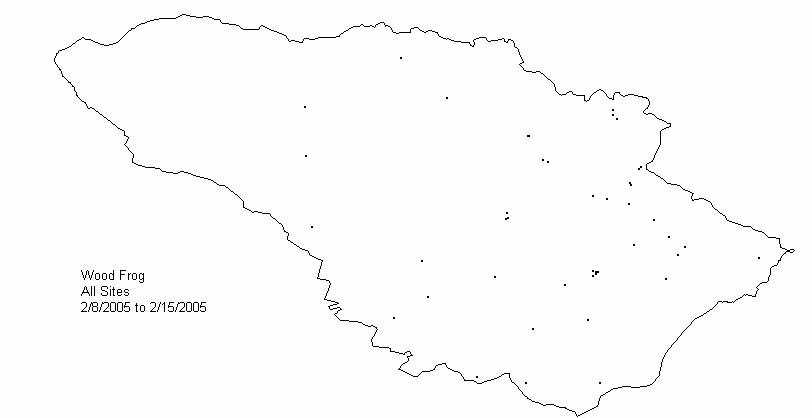
Animated display of weekly wood frog (rana sylvatica) activity reported during the 2005 season. The size of the green square represents the maximum intensity of calling that was heard at the site in the week. (An error for the volunteer-provided data for one of the sites is obvious since the latitude/longitude places it beyond the county border.)
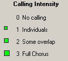
The system provides both mapping and tabular results and allows easy data selection by amphibian species, date range, observation location, and characteristics of the observation site (e.g., type of body of water, permanence of water, etc.) The system can also display an animation showing temporal changes at several time scales.
Any combination of sites, species, and dates may be selected for viewing. The display (map and data tables) can also be animated, with each step representing a selectable length of time (e.g., week, month). It is also possible to display data aggregated across all years for the specified range of months/days. This is useful for visualizing multi-year phenology.
Map view during animation, with date parameters specified to the left.
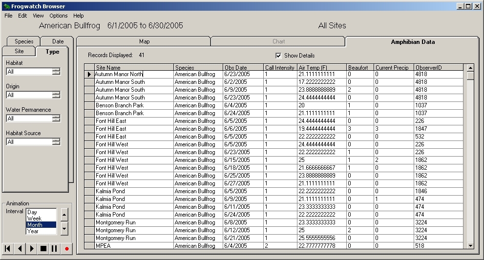
Table view of the same data with the (unused) site type selection parameters to the left. The table data can be sorted by any column and filtered using any value.